
Adding new painting and finishing tricks to your repertoire helps keep your skills sharp and your modelling from stagnating and projects from getting dated looking. Back in the 80s and 90s, washes and drybrushing ruled, especially in armor. When you look at photos of some of the models from the more extreme drybrush and wash days, they look a little odd... OK, some of them look positively freaky. Drybrushing and washes are excellent tools when used sparingly, but like all fads, some tend to think that more is better, and even more is even more better-er.
Subtle panel washes, to my way of thinking, add depth to the shadows cast by full scale panel lines. There is no way that a small scale model's panel lines can reproduce that look without a little help. Taken to extremes, it looks harsh and forced. Done subtly, it adds realism, IMHO.
Drybrushing does the opposite. it helps small detail stand out from the surrounding area by carefully painting the edges and high points a lighter color. This simulates the reflection of light caused by full scale details. Taken to extreme, it looks like an artificial Christmas tree (or non-denominational celebration shrub) that has been flocked with artificial snow.
Pre and post shading are relatively new to the hobby, having become popular in the last decade or maybe longer (didn't look at my watch when the fad was born). The idea is to spray a darkened shade of the camouflage paint along some panel lines to add visual interest and depth. In the hands of a good painter such as Chris Wauchop, it can look very authentic. Overdone, it can start to look more like Kabuki makeup. It is not a good idea to shade ALL of the kits panel lines. You can end up with a weird patchwork quilt look. I try to his some of the more major panel lines, and again not all of them, and not to the same extent. It is a battle for me to find a good balance of post shading, where it is dark enough to be seen, but not so dark that it looks overdone. Subtlety is the key to weathering aircraft models.
Finally, the breakup pass. I learned about this when I was working in movie modelmaking at ILM . I did a lot of painting on Star Wars Episode II. I worked with some great painters, and learned a lot. The idea behind the breakup pass (this is what they called it) is to add subtle color variation and visual texture to large single color areas.
If you really look at any real painted outdoor surface that is not freshly applied, you will find that it is not one color. Weathering and age plays havoc on painted surfaces. Notice the fine dust coat that has been speckled and streaked by morning dew and rain. Notice the slight variations in color. This is what the breakup pass seeks to simulate. Artists and movie special effects guys have been using these tricks for many, many years. We have not discovered anything new. We are just finally getting around to making it our own. And the line between model making and art blurs...
As this model is 1/72nd scale, there is not a lot of canvas available to get too involved in the more artistic aspects of weathering. To postshade a color, I simply add a drop of black to the base camouflage color (lets say ocean grey in this case) and go back and spray carefully along selected panel lines to darken them somewhat. This should be kept fairly tight, in that you do not want the shadow straying too far into the surrounding panel, but not so tight that it looks like a hard line. Vary the intensity. I may also add some fairly light and narrow lines between panel lines in larger scales to simulate rows of rivets, but this should be VERY subtle. Just hinted at, really.


Wheels were sprayed with Tamiya rattlecan silver. A black wash pops out the detail.
Finally, the breakup pass is done by loading the base color into the airbrush and adding a drop or two of white. I start by spraying a random pattern of spots, shapes and squiggles over the base color. The key word here is random, not a series of similarly sized spots evenly distributed over the surface. Some areas with larger spots, some areas with light coverage and some with a mix. Be careful of a subconscious repeating of random patterns. Make sure you are not making it symmetrical. Again, keep it subtle. It should be hinted at. You can also go back with the base color and darken it a hair, or add a drop of yellow or green, and do some very light breakup.
Be aware that a panel wash, gloss coat and decals will tone down the look. If it is TOO subtle, you may with up with a breakup that is hardly noticeable. There is no magic formula. Look at models you like. Study what they did and strive to repeat it. Practice. Build and paint some models. Do some quickie builds to get practiced at it.
Now that the camo painting is done, I sprayed a coat of Future thinned with a drop or two of water to help my older bottle flow a little better. Future is wonderful stuff. Makes the fragile Tamiya paints tough and sandable. It was left overnight to dry, then it was time to make with the decals, baby.

Resin prop blades are drilled and pinned with stiff wire for strength. This also helps in aligning them while the glue sets.
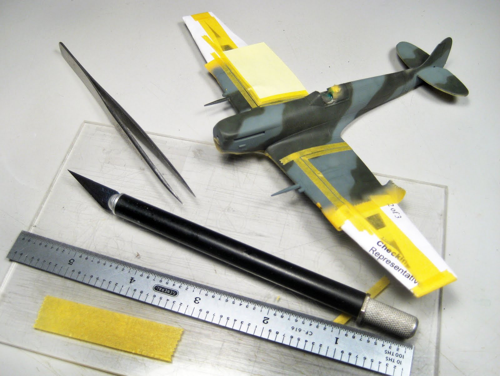
Decals come, of course, from Barracudacals, sheet number 72004 to be specific. Shameless plugs ARE my bag, baby! As nice as the model would look with the upperwing roundels in place, it is very unlikely that they were not overpainted for the Starkey missions, so were left off on this model. The underwing roundels and trestle markings were also not used as the stripes covered them over. The markings are confined to the fuselage on this build with the exception of some stencils on the wing, tailplanes and prop blades.

With all the decals on now, it is starting to look like the finish line is within sight.
Some have expressed concern with BarracudaCals' rendition of British Roundel Red. They worry that it is too rust brown or terra cotta colored. Surely, the red should be more... well... RED! Most kit decals print them as such, but this is not correct. I have carefully matched the roundel red color to the paint chips in the RAF Museum Guide book on British camouflage in WWII, as well as color chips found in the old Aircraft of the Fighting Powers books publish during the war. Our roundel red is a good match.
I'd gush on about how wonderful the decals were; how well researched they are and how well they go down on the model, but that would be crass. You'll not find me saying that they are thin, beautifully printed, and very thoroughly injured. Huh? Injured??? Wow, I just typed that as I was fading off into a short episode of microsleep. Guess I'm more tired than I thought. LOL. Researched... very thoroughly researched. Yes, you won't catch me saying anything self-serving about my own products like that. At least not until I go take a quick nap to wake myself up a bit.
OK, I'm back again. The decals worked extremely well (they almost applied themselves, and thats not hyperbole. OK, it is.), and the model was left to dry overnight. Coincidentally, at this point, the article on building this model will also be left to dry overnight. This is a good place to stop. Maybe not for you, but I have some other things that need my attention tonight.
The final installment will follow shortly. It will cover the final push to completion, and will feature a number of photos of the finished build. See you back here soon for more fun with plastic.
Happy modelling! Roy


Very nicely done!... and good information, too.
ReplyDelete